Data visualization
Designing and developing data visualization with transitions and interactions.
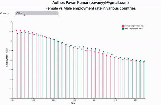
Male vs Female employment rate
I have selected 5 interesting countries from the dataset shared in the project repo.
I have compared the contrast using line plot and different colors for female and male data.
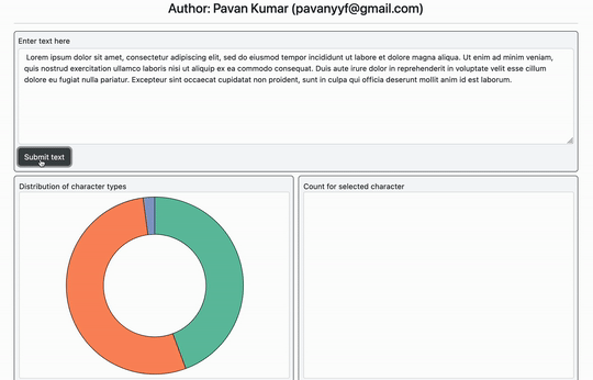
Text Corpus Viz
Given a text in the textbox,
The viz will plot pie chart depecting percentage of consonants, special characters and vowels.
Clicking on each pie will plot a bar chart showing distribution of each letter/symbol belonging to eacg pie category.
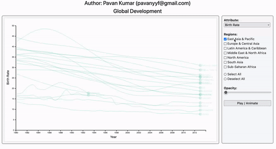
Vizualization of Global development indicies.
Dataset - https://corgis-edu.github.io/corgis/csv/
The viz tries to plot the contrast of development across regions. This is a multiline graph to show development from 1980 to 2013, each line depicts a country.
Interactions:
- Allows selections of multiple regions, each region are associated with a color.
- Allows to select/deselect all regions.
- Allows to set the opacity of the graph, to reduce clutter
- Allows to highlight a particular country by either hovering over line/endpoint/name associated with it.
- Allows to show the slow animation through the time for selected regions.